Tuesday, April 19, 2011
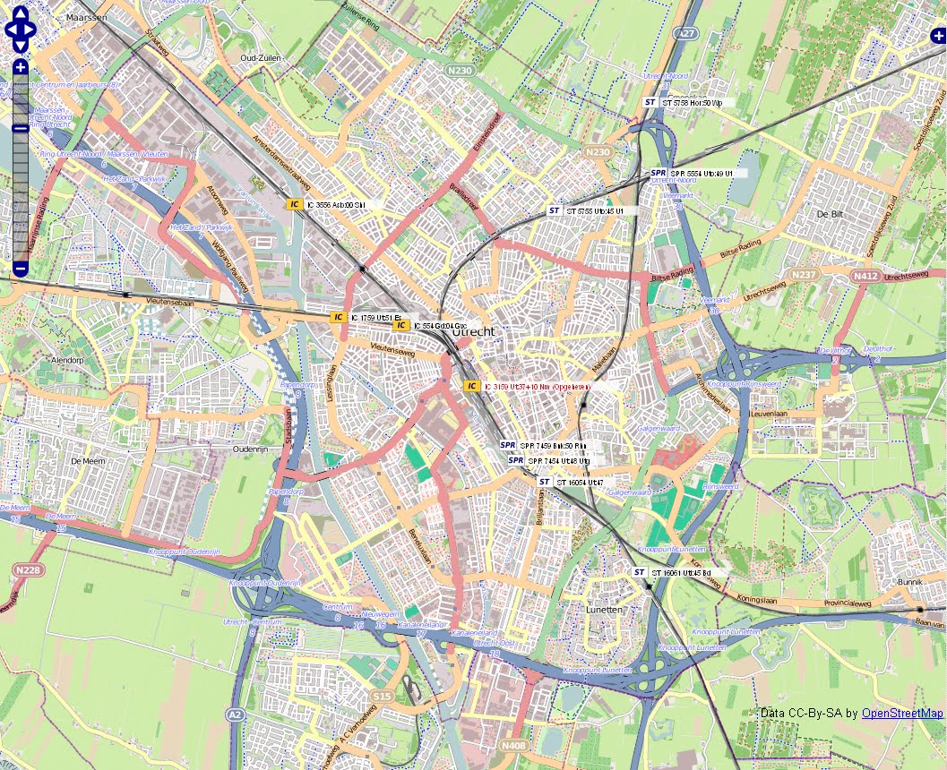
Dutch railway network in real-time
The Dutch have put their rail network online so that the positions of all their trains can be visualised in real-time. Using the OpenStreetMap template, this great website shows some of the clear benefits to opendata and is an example to all transport providers.
Monday, April 18, 2011
Infographic: Deaths in American Civil War
 A brilliant infographic, designed by Gene Thorp for the Wall Street Journal, paints a harrowing and yet fascinatingly vivid picture of the American Civil War. Using a Google Maps template, the infographic charts the location and time of all the deaths in the American Civil War.
 Through the better presentation of long forgotten information such as death figures in the American Civil War, we are able to look at such important, dramatic and horrifying historical events in a new light. When I looked at this infographic for the second, third or fourth time, I began to notice the almost organic detail of war. The ebbs and flows, the importance of geological factors for the movements of troops and inevitably, for the movements of death. I began to recognize troop movements as they left a trail of deaths behind them. The concentration of fighting around rivers revealed the importance of these physical barriers in battle. I noticed the geographical concentration of the fighting in Virginia, Tennessee or NW Georgia. I noticed the lulls in fighting following particularly deadly battles or the letup in fighting during the harder winter months and the terrifying upsurge in deaths as Spring arrived in 1863, 1864 and 1865.
 The infographic is truly brilliant. With the ability to zoom into certain areas and to shorten the timeline, one could easily spend hours studying it (I would know!).
 With some tweaking I imagine that the deaths could be divided between Unionist and Confederate. This would paint a more strategic picture rather than the human one which is currently displayed.
With a lot of work, a similar presentation could be done for WW1 & WW2. Hell, why not Iraq, or Lybia...hell, why not all conflicts?
Google/UN partnership maybe? Or maybe I should just do it..
Crisis & Information: catalysts for a worldwide budget revolution?
 A fantastic "Every Day is Tax Day" infographic designed and developed by Fred Chasen, shows just how much of a US citizen's wage goes to the government and through which department it is spent. This information, revolutionary for the taxpayers' perception of their government spending, may be heralding a new age of greater accountability for government budgets.
 With the US seemingly trapped by internal bickering on its budget; with the EU about to announce a new budget increase this Wednesday likely to cause outrage throughout EU Member States that have been forced to make politically suicidal public sector cuts and with the anti-eurobailout party True Finns about to rejoin the Finnish Government, the question I ask: are taxpayers finally getting some of the representation they deserve?
Thursday, March 31, 2011
Infographic from Chartsbin shows global urbanisation trends and highlights crisis in global water management
Chartsbin released an excellent infographic on 22 March 2011 - World Water Day didn't you know! - to highlight and focus attention on some of the very serious and often deadly consequences related to the human management of fresh water supplies, especially within heavily populated urban areas.
The Chartsbin infographic offers an interactive visualization for easy viewing of the latest and most relevant data on urban water and sanitaion management. The data was collected was a number of reputable sources such as the WHO, National Geographic, the UN and earthtrends.
The graphic below is just a screenshot. Visit their site for the real experience.

For the moment, Chartsbin is also offering the use of its global map templates for FREE! It allows users to input any data into a global map template and should be a invaluable tool for anyone whishing to present global trends and data in an easy to view format. Shame they haven't used the more accurate Gall-Peters projection map of the world for their template but nevertheless a brilliant tool. Copyleft likes!
Friday, February 18, 2011
The global alcohol business - part 1
A report released by the World Health Organisation has revealed that Moldovans head the global alcohol drinking league table and that Islamic traditions have played an important part in restricting alcohol consumption.


While the global average is 6.1 litres of pure alcohol per year, Moldovans got through 18.2 litres in 2005, nearly 2 litres more than the Czechs in second place. While eastern Europeans drink more than their western neighbours, their Islamic neighbours, as this map from The Econ
omist shows, must seem like tee totalers. The religious factor - more specifically the Islam/Christianity divide - is clearly pertinent for understanding the very different drinking culture of the two regions.
Significantly, the WHO estimates that alcohol results in 2.5m deaths a year, more than AIDS or Tuberculosis. But one must not forget that with an average 6.1 litres drunk a year by people, alcohol plays a large part in many people's lives.
So alcohol is consumed in large quantities all over the planet but where does it all come from? Having identified who drinks the stuff, a good question to now ask must be: who is responsible for providing so many people with their favourite tipple?
In 2008, China maintained its position as the world's biggest beer nation, producing over 410m hectolitres, which was four times the volume pro
duced by Germany. Germany, with beer output of about 103m hectolitres in 2008, was in fifth position in the world rankings, behind China, the USA, Russia and Brazil.
While less important than the beer market, 269m hectolitres of wine were produced in 2009 (not including juices and musts). The wine market continues to be dominated by Italy, France and Spain as the chart to the left shows. The New World producers, such as the USA, Argentina, China(!?), Australia, Chile, South Africa complete the top nine global producing countries.
Finally global spirit production appears to be centred around a very small number of giant global companies, very much like beer production. These companies, like Diageo or INBEV for example, distort attempts to label the origin of alcohols given that while they may be based in London or Brussels their production is clearly global. A quick look at the list of plants that Heineken owns reveals just how global the alcohol market has become.
Wednesday, February 16, 2011
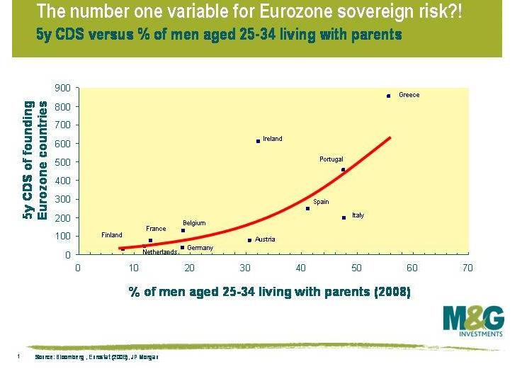
Leaving home early will save your country from the EU and IMF
A great blog from Macronomics has put together a number of charts and graphs to show the problem of unemployment in the young, in the EU. The best of the bunch has to be this one below which seems to find a correlation with the age that children leave home and the sovereign debt problem of a country.

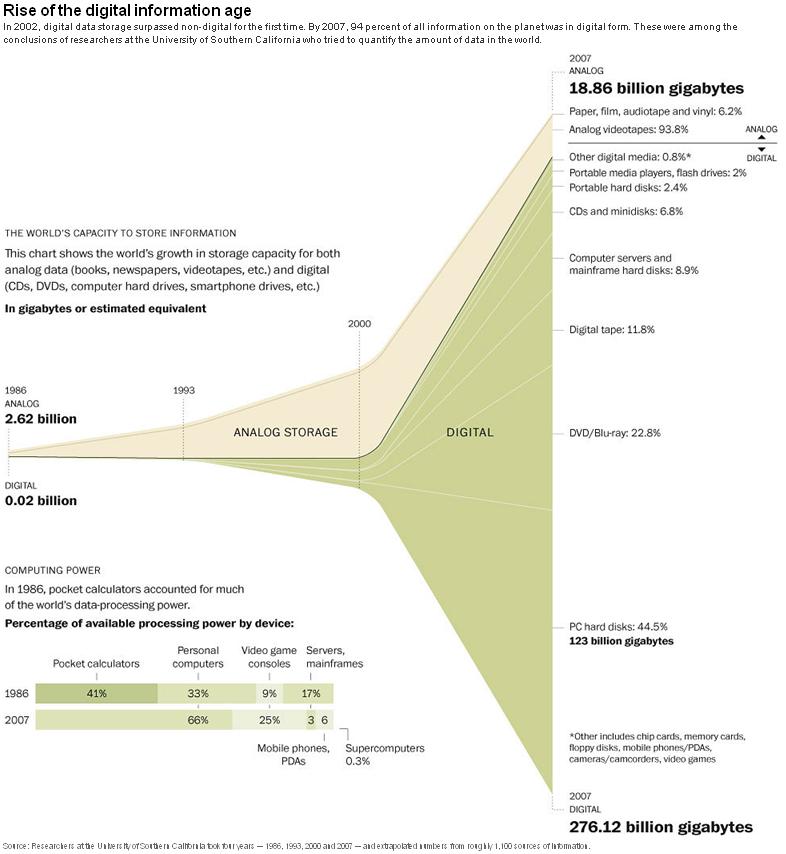
Visualised: Rise of the digital information age
The Washington Post has visualised research from the University of Southern California that demonstrates just how dramatic the explosion of the digital information age has been. Attempts to quantify the amount of data in the world recently led to the creation of a new word - the exabyte. An exabyte equals one billion gigabytes and the need for new terms such as this demonstrates just how digital and data-intensive the world is becoming.

Subscribe to:
Posts (Atom)